
Introduction to Dashboards
Overview
There are currently four primary dashboards on the QIVIR platform that give you insights into how your marketing efforts are performing. From many of these dashboards, you can export all of the underlying data and perform your own detailed analysis if needed.
The Splash Metrics dashboard on the main landing page is designed to give you a quick count of your active phone numbers, QR codes and Campaigns through the scorecards. The pie charts will indicate which ones in each category are your top performers.
The QR Codes & Links Dashboard provides a view of all QR code scanning and shortened link clicking activity that your marketing efforts have driven. The scorecards and charts at the top provide trend information as the table grid data below gives you access to each individual activity that was performed and access to various actions to take on each activity. The ellipse menu on each row allows quick access to various actions that can be performed on that data, and the export and refresh buttons are in the top right corner of the grid.
The Calls Dashboard provides a view of all phone number and call activity that your marketing efforts have driven. The scorecards and charts at the top provide trend information as the table grid data below gives you access to each individual activity that was performed and access to various actions to take on each activity. The ellipse menu on each row allows quick access to various actions that can be performed on that data, and the export and refresh buttons are in the top right corner of the grid.
The Campaigns Dashboard provides a view of all activity that your marketing efforts have driven tied to the campaign assigned to each resource. The scorecards and charts at the top provide trend information as the table grid data below gives you access to each individual activity that was performed and access to various actions to take on each activity. The ellipse menu on each row allows quick access to various actions that can be performed on that data, and the export and refresh buttons are in the top right corner of the grid.
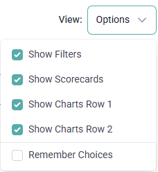
View Options
In the top right corner of all dashboards, there is a view option menu that allows you to select which components of the dashboard you want to view. By default, all components are visible, you can hide individual components by de-selecting the option's checkbox. To persist your selections, select the 'Remember Choices' checkbox at the bottom of the drop-down menu.
Disabled Resources Filtered Out
It is important to note that the scorecards and charts exclude activity from QR codes, phone numbers and campaigns that have been disabled as these charts are meant to show activity from currently enabled resources. The table grid data below the scorecards and charts do not filter out activity from disabled resources as action may need to be taken on individual activities that have been performed by your leads and customers.